
Header
Your logo, your name, the links you choose and a booking button. It follows the reader down the page.
Twenty-four sections. You drag them into the order you want, write straight onto the page, and publish when it looks right. Every picture below is a real storefront, captured as it renders, in one business’s fonts and colors. Yours wears your own.
Free to build and run. No subscription, no setup fee. Ollie takes 5% only when you get paid. Stripe's card fees are separate and go to Stripe, not us.
The chrome a storefront comes with. Style them, fill them in, and hide the ones you do not need.
Your logo, your name, the links you choose and a booking button. It follows the reader down the page.
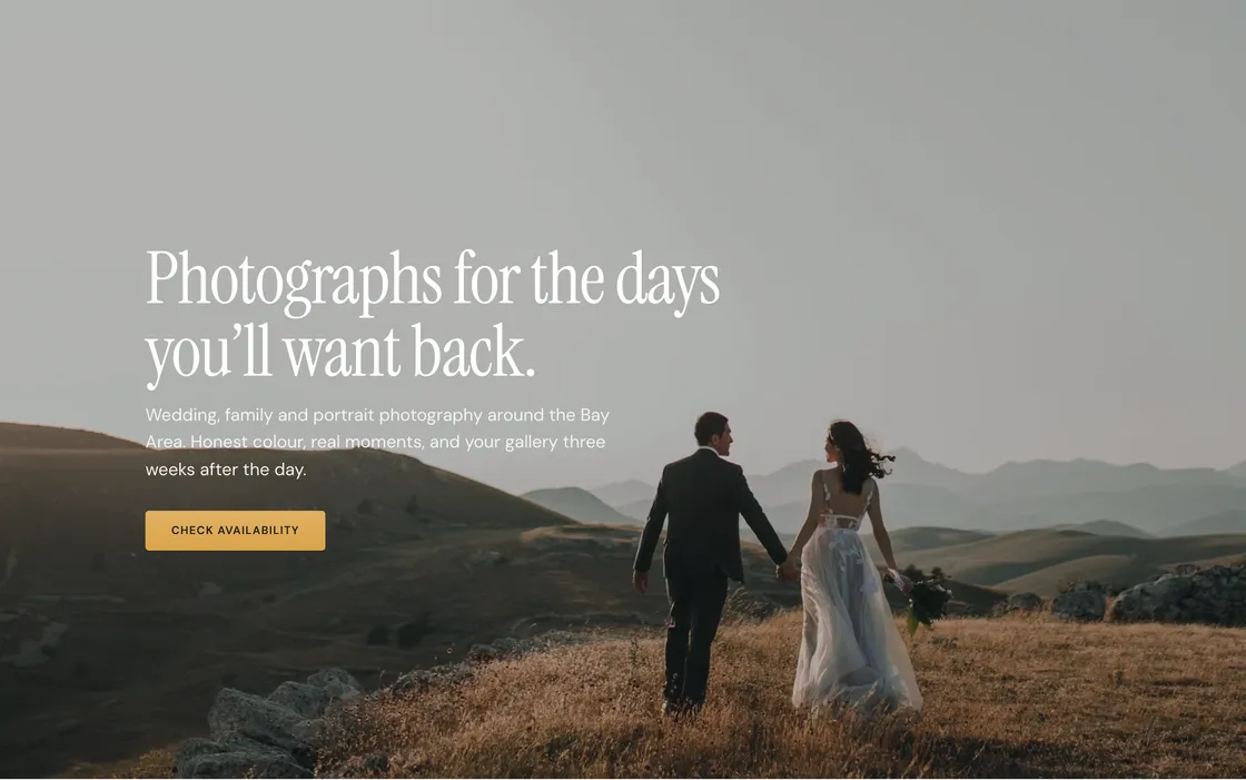
The first screen: a headline, a line of copy, a photo behind it and the button that starts a booking.

A thin strip above the header in your brand color, for the thing you need everyone to read.
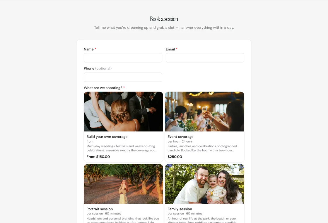
How customers reach you. Ask for whatever you need, and let them pick a real slot from your calendar.

The hours you actually keep, straight from the ones your booking calendar runs on.

Contact details, social links and the small print at the foot of every page.
The trades Ollie is built for are judged on what they have already done. These are the blocks that show it.
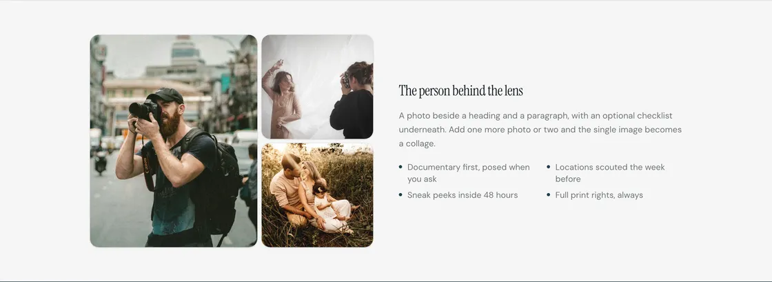
A photo beside a heading and a paragraph, with a checklist under it if you want one.
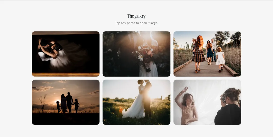
A grid of up to 24 photos that open large when tapped. Two, three or four across.
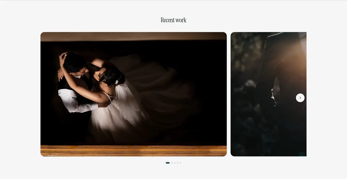
A swipeable strip of up to ten photos.
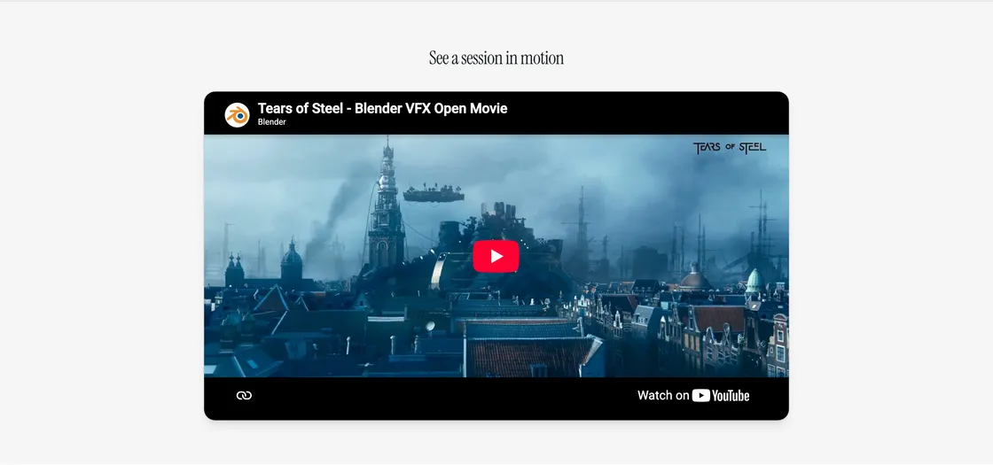
A YouTube or Vimeo video, embedded on the page.

A heading and a paragraph. The plainest block there is.

A thin line, for when two sections need air between them.
Prices a customer can read and a button they can press, on the same page.
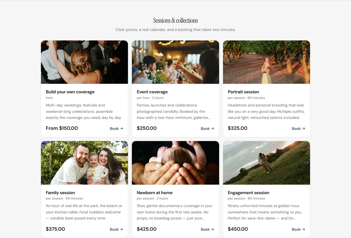
Your services with photos, prices and a Book button. Choose which ones show, and whether they sit as cards, rows or a priced list.
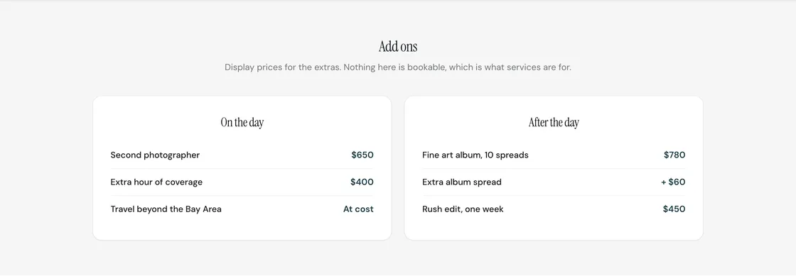
Titled lists of prices for the extras. Display text, so you can write “at cost” or “from $60”.
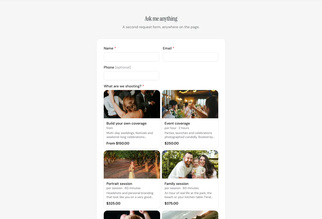
A second request form anywhere on the page, showing whichever of your forms you point it at.

A strip in your brand color with a line of copy and a button.
The reasons someone picks you over the next result down.
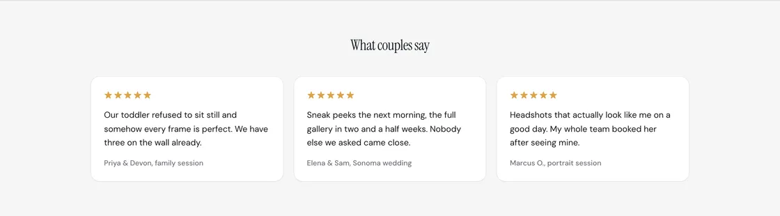
Several customer quotes with star ratings. From four up they drift across the page on their own.

One customer's words, given the room to be read.
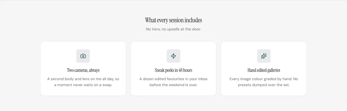
Cards with an icon, a title and a line each. One block covers both what you offer and why to pick you.

Big figures that build trust: years in the trade, jobs done, how fast you answer.
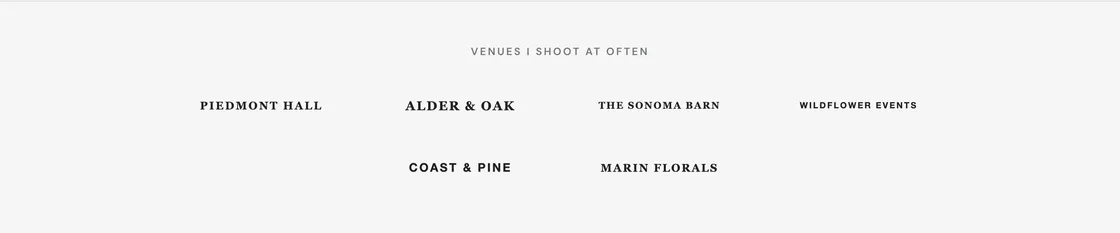
A quiet row of partner or client logos under a small line of copy.
What they would otherwise have to call and ask.
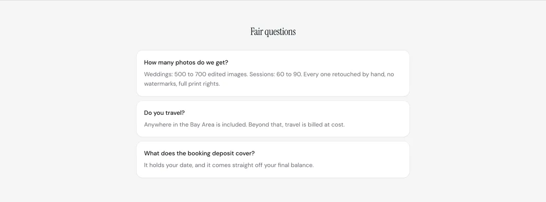
Questions and answers, as open cards or as rows that fold away until they are tapped.
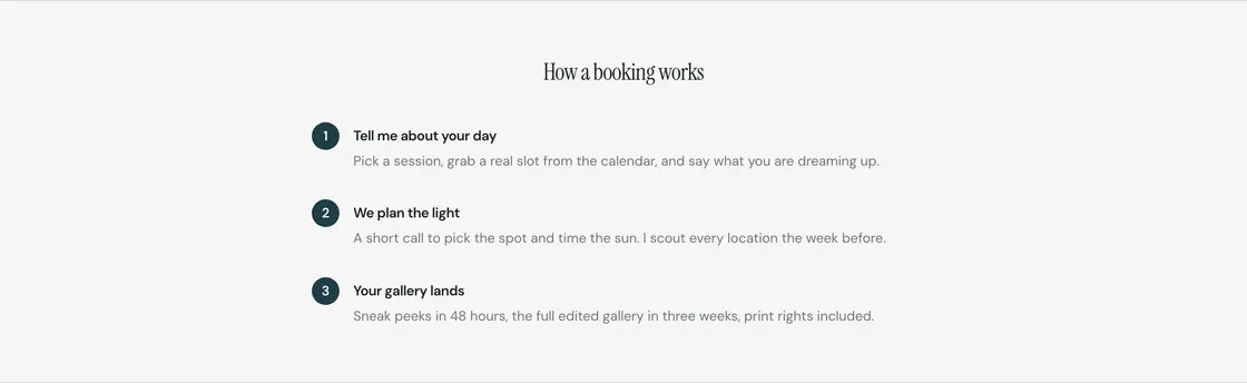
Numbered steps, for the customer who wants to know what happens after they press the button.

Address, phone and email. Empty lines simply do not appear.
Start with a finished design, swap in your photos and words, and publish at your own address. Nothing reaches a customer until you say so.
Ollie uses analytics cookies (Google Analytics, PostHog and the Meta Pixel) to see how the site is used and which ads work. None of them load unless you say yes. Sign-in and your choice here use essential storage only. Read the cookie policy.